
Review of the Series of 1928 $1 Legal Tender Funny Back Note
There was a smaller sized $1 1928 Legal Tender Note which has become a must have note for collectors, partly because it had an exceptionally limited run that lastly only 2 months and twenty seven days. But where does its unusual name come from?
Currency Highlights
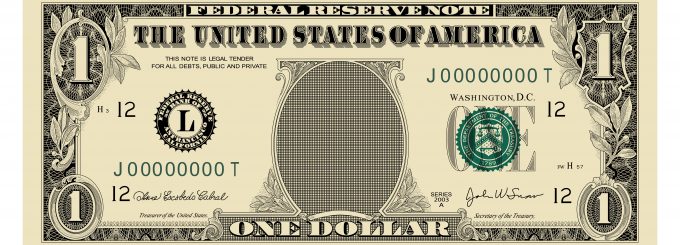
This note features a red colored seal with signatures from Woodin/Woods and a grade of Choice Uncirculated. Upon close inspection it becomes evident that this note showcases a very impressive white colored paper with bright serial numbers and reverse margins that are uneven. The total number of bills issued for the series was just over 1.8 million units, so while it isn’t the rarest note; it is tough to find specimens of this quantity.
Today, over ninety years after its inception, the funny back is still a note which stands out. This is because of its artistic design which was geared towards preventing counterfeiting. During the late 19th and early 20th centuries the quantity and variety of banknotes had increased sharply. At the time, most had a size which was about 7 3/8″ x 3 1/8″. This also meant that the ink and paper cost used to issue them had also increased.
As a consequence of the higher costs involved with currency creation, by 1925 the Treasury Secretary Andrew W. Mellon put together a committee which would come up with ways to reduce expenses. Two strategies they came up with to achieve this were to reduce the size of the bill by twenty five percent, making it 6.14″ x 2.61″, and to give it a fresh typeface.
Background
The BEP (Bureau of Engraving and Printing) has always been adept at square lettering and script, so they were able to utilize Gothic font for numbers and letters. However, they maintained the scrollwork which framed the note’s presidential portrait while its borders were borrowed from a 1923 redesign that utilized the Art Deco style. Once this was done, the next phase was to initiate a campaign nationwide to notify citizens that the current bills which had been in usage since the American Civil War would soon change.
The BEP by 1927 begin shipping displays to nationwide banks. They also dispatched speakers to various areas of the country. Finally, in 1928 the notes were unveiled to the public, including small silver certificates. Most of the nation was thrilled with them, except New York. A graphic designer there by the name of W.A. Dwiggins coincidentally released a book called “Layout in Advertising” the same year, and he publically criticized the choice of font, stating that Gothic was not very commendable because of its lack of legibility and grace. Others felt the same way, most notably Louis A. Hill, who was a former director of the BEP. Aside from aesthetics, there were also security concerns since some felt the bill’s new design and size made it easier to copy because of the crude workmanship. However, in the half century since the Funny back has increased in popularity.